Digital Financial Superpower
Digital Financial Superpower was a four-month long, fully-responsive interactive comic book experience.
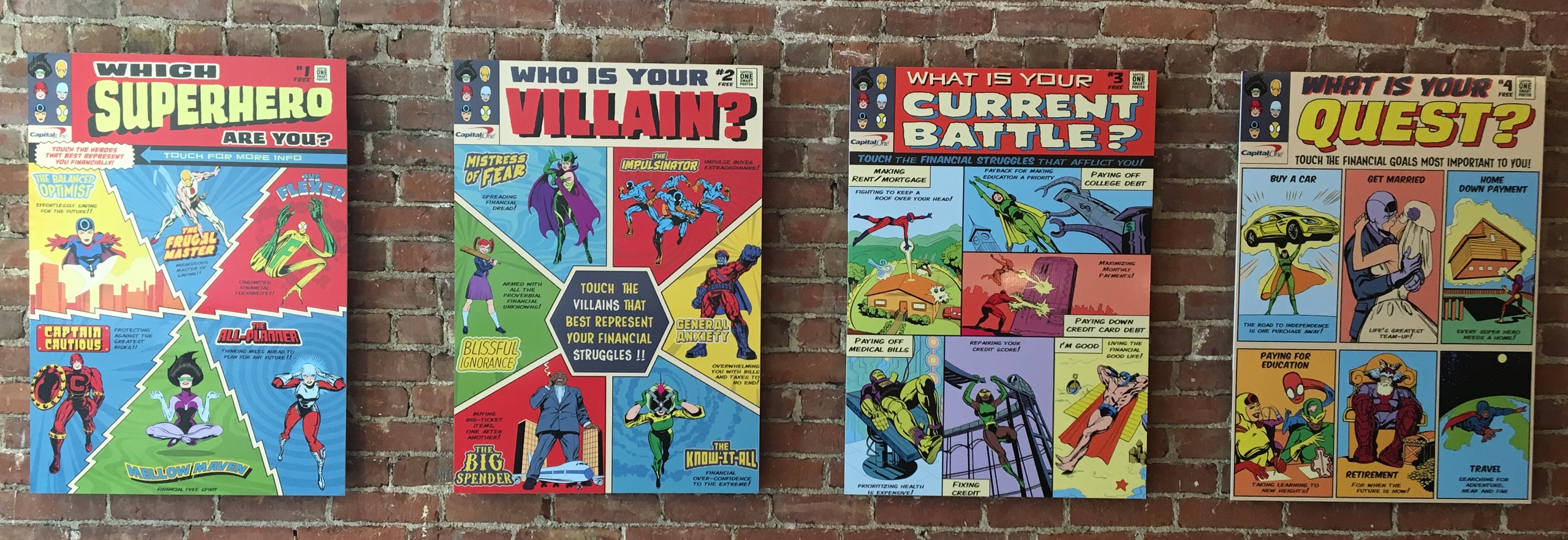
Digital Financial Superpower came about from the desire to do a National Marketing Campaign around the original in-café Financial Superpower experience, a series of four superhero-themed posters designed to capture users’ financial strengths, weaknesses, current battles, and quests. Because Capital One cafés are only located in a few major cities across the United States, the marketing team insisted on having a digital experience, available to everyone regardless of location, to accompany the physical in-café experience.
As the Creative Director of this project, I managed a writer, a product designer, a voice actor, a Marvel cartoonist, and a number of internal and external technical and marketing partners. I also met regularly with the internal ADA Compliancy and Legal teams to get approval on the experience, branded characters, and story to make sure there were no surprises along the way.
Design Briefs
Initial Ideas
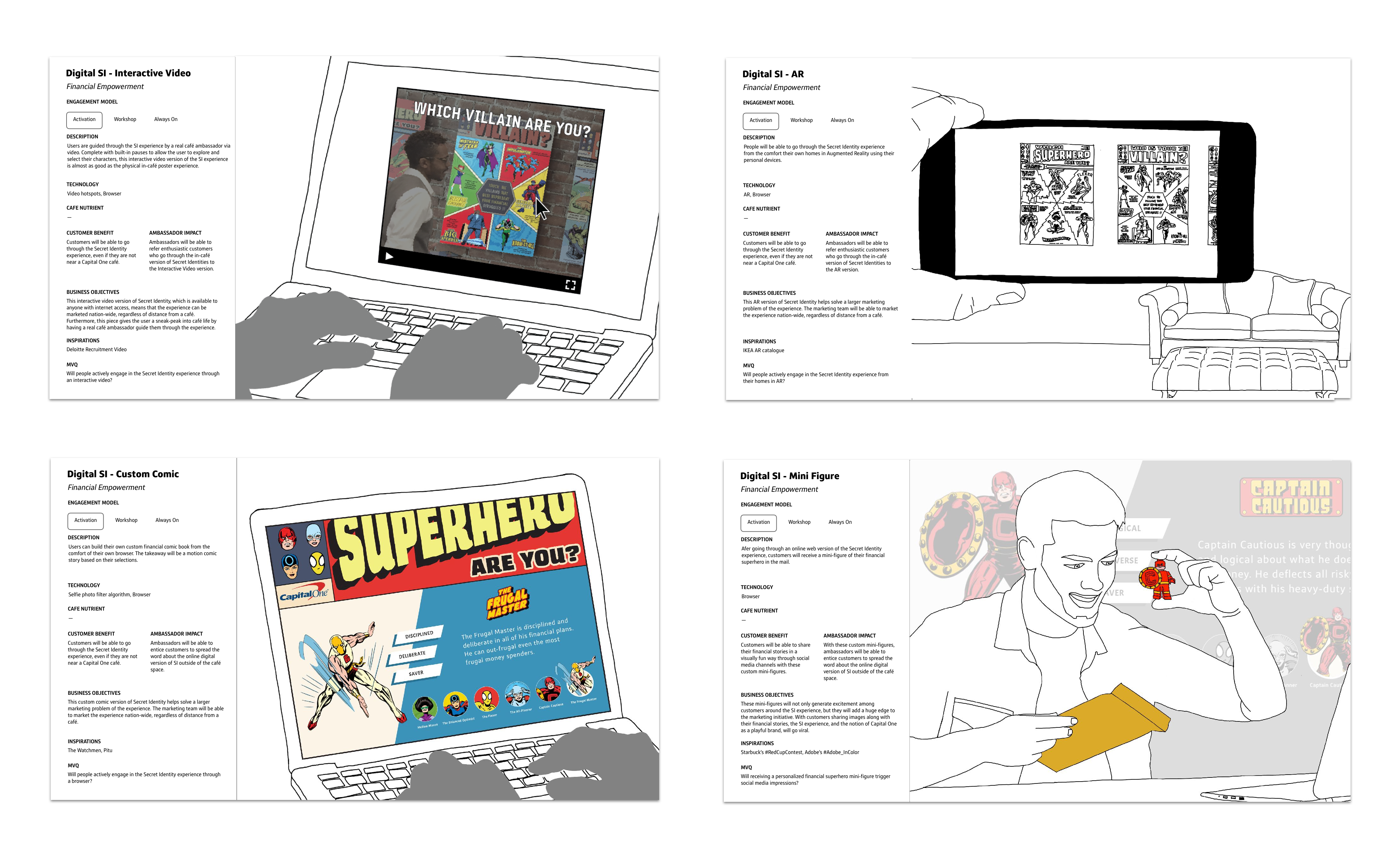
The success of the in-café Financial Superpower experience was directly tied to the ability for our customers to have meaningful conversations with our café ambassadors (what we call our café employees internally). After brainstorming a few different potential directions for this digital experience, including AR posters and an interactive video, we quickly realized that a direct translation of the physical poster experience to the digital world would lose its most important aspect: the conversation.
Design Principles
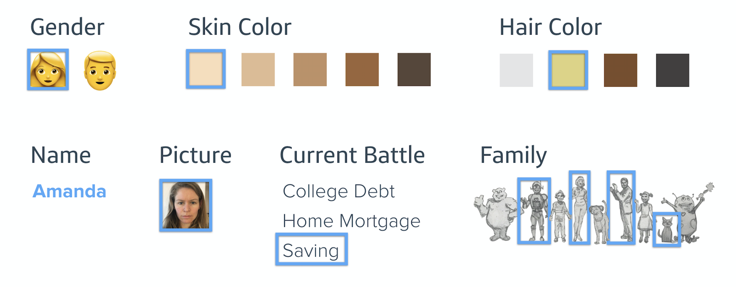
Since there was no scalable way to incorporate this conversation piece into the digital experience, we decided to focus on the narrative instead. The comic book narrative, we decided, had to have a strong focus on inclusion, one of the design principles we relied on when creating the original poster experience. More specifically, to create a truly personal financial comic book, we decided that users should be able to choose their superheroes, villains, financial battles, and quest, set their gender, give their name, customize their family members, and incorporate their own selfie into the story.
Managing Scope with Tight Deadlines
Almost immediately, we had to narrow down the scope of the digital experience due to the tight timeline (the National Marketing Campaign launch was set for 3 months later). By allowing our users to build their own story with 6 different superhero choices, 6 different villain choices, 6 different financial battles, and 6 different quests, the number of story permutations was already out of hand (1,296) — and that wasn’t even including the option of having a male or female character. Before engaging Stephan Bugaj, the script writer, we narrowed the story down to default to one superhero, The Balanced Optimist, which (in our opinion) was the most ideal superhero of the bunch. We also decided to limit the financial battle selection to 3 options (college debt, home mortgage, and saving), which would then, in turn, automatically match our users up with the most likely villain. Since the quests came at the end of the story and wouldn’t add a significant number of different panels to the story, we decided to keep all 6 of those options. [We later decided to ditch the quest section due to budget constraints, but I’ll get there.]
Writing the Script
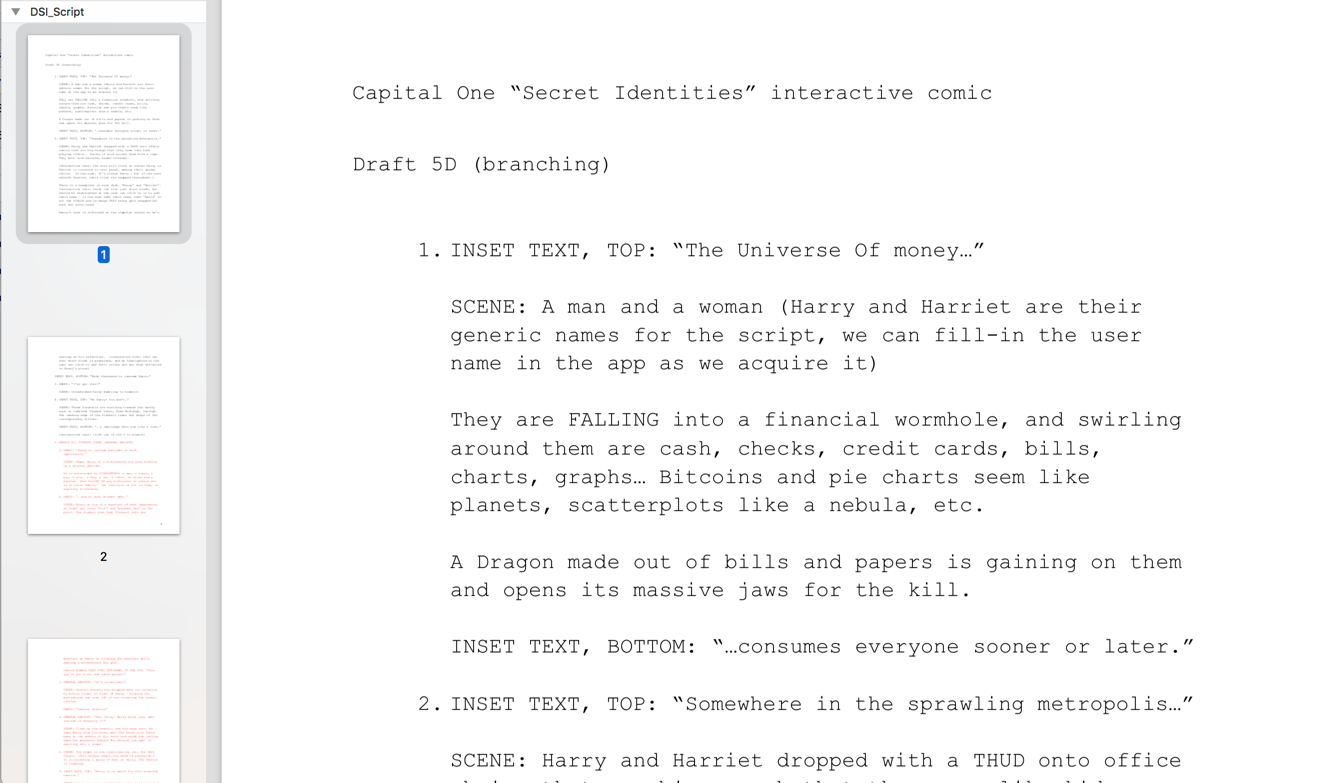
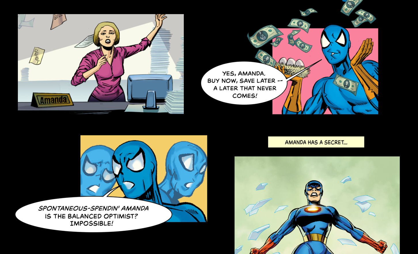
After a bit of back-and-forth on the script with Stephan and some fine-tuning requests, we landed on a story narrative that we were happy with. I was really pleased with the way he incorporated the user’s name into a nameplate on their desk and their selfie image in the reflection of their computer screen at work – so seamless and elegant.
Creating the Artwork
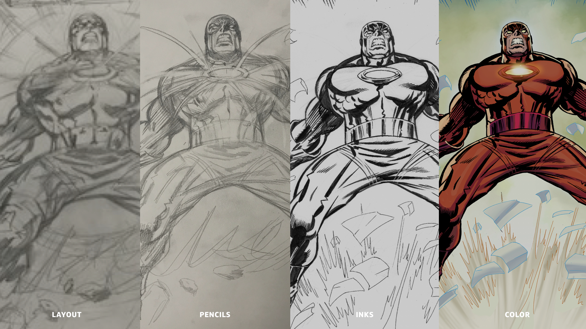
With the script approved, we engaged in full force with Ian Dorian, a true Marvel comic book artist, on the panel artwork that would tell the story.
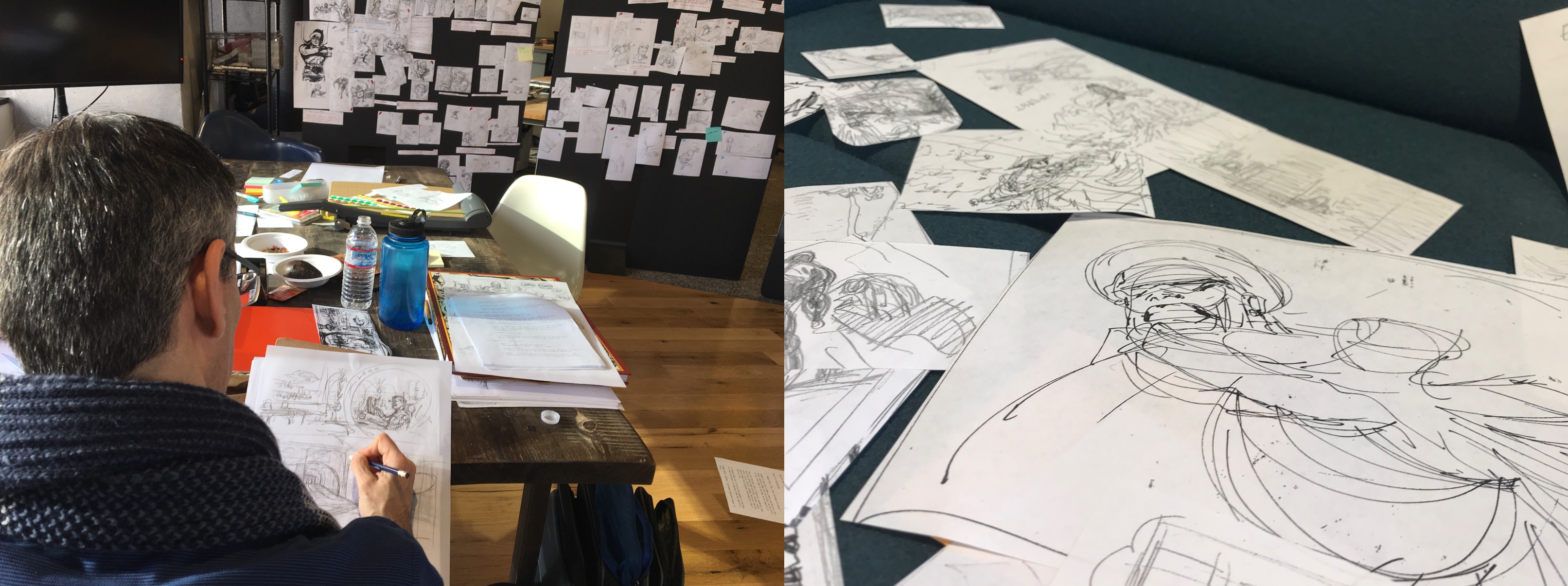
His first pass at the layouts was messy (as it should be at this stage) – lots of loose sketches showing character expressions, scene backgrounds, perspective, angles, sizing, etc.
Aligning the Script and the Artwork
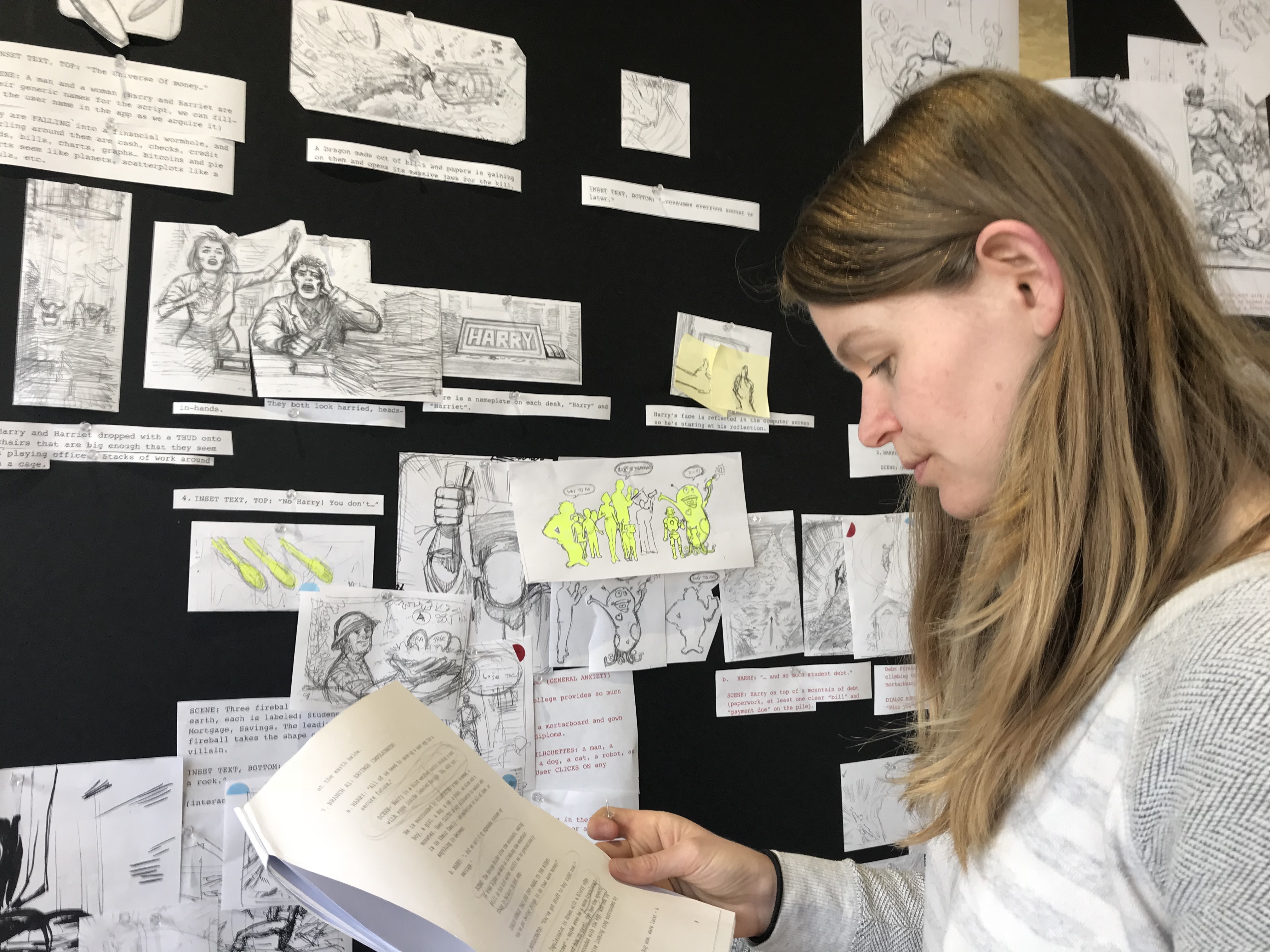
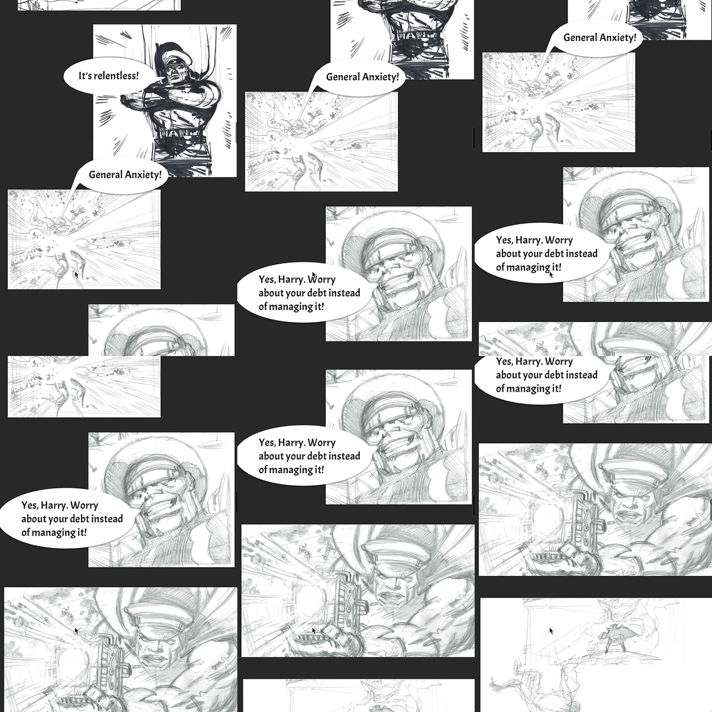
We printed all of Ian’s layout sketches, cut them up, and pinned them up to a foam core board. To prevent ourselves from going insane, we created dedicated sections of the board for each branch of the story (1. Story Intro, 2a. General Anxiety/College Debt, 2b. Mistress of Fear/Home Mortgage, 2c.The Impulsinator/Saving, 3a. Entrepreneurship Ending, 3b. Marriage Ending, 3c. Buying a Home Ending, 3d. Education Ending, 3e. Retirement Ending, 3f. Travel Ending). We also printed out the scripts in large font so that we could cut pieces of that out and match it to the layout panels to make sure we weren’t missing any images. To make things easier to understand, we highlighted sections of the story that were interactive.
Initial Wireframes
Once we had compiled detailed notes of which panel images were missing, needed changes, etc. and passed those on to Ian Dorian, I went straight to work translating these flows into a digital (but static) wireframe state so that I could compile the layout images in chronological order, play around with image placement, and also add accompanying script text, such as inline text narration and chat bubbles. The first combination I put together was of the male character and the General Anxiety/College Debt branch.
To ensure that people understood and related to the story line, we recruited five younger employees who had just finished college and were part of the new grad rotation program at Capital One to look through this static branch of the experience. We also timed them as they scrolled through the compiled sketches, which gave us a good time range of experience commitment (they took anywhere between 2 minutes and 5 minutes to complete the experience, with an average of 3 minutes and 11 seconds).
From our initial in-house static wireframe user tests, we learned of one crucial misunderstanding in the story: People did not understand that the villain dropping in was associated with the fireball/comet. Because of this, we added an extra panel showing the comet hitting debt mountain right before the villain’s first appearance.
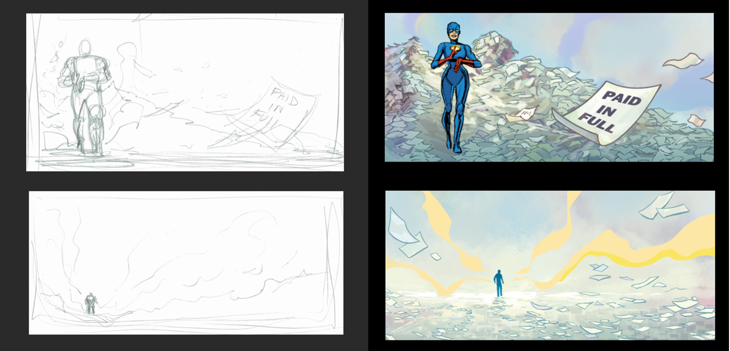
It was around this time that we decided to remove the final quest section from the experience. Due to added combination complexity of the comic book reader (the quests would have added 6 more possible endings), but especially time and budget constraints to get those images inked and colored, we decided to create two new concluding panels instead. These two panels would be used at the end of the experience, regardless of the current battle choice.
Interactive Components
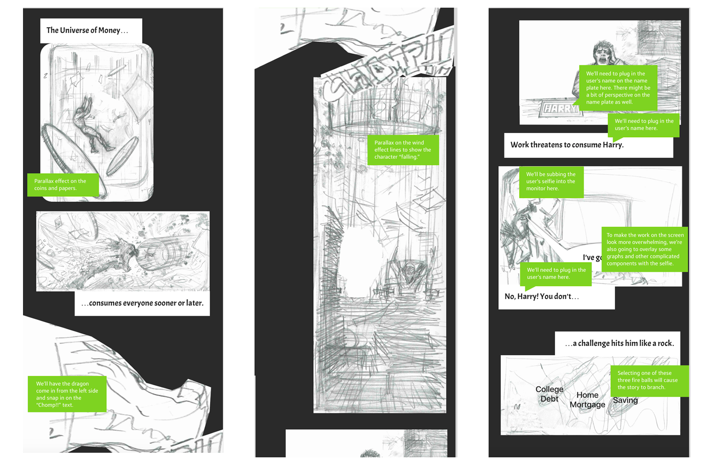
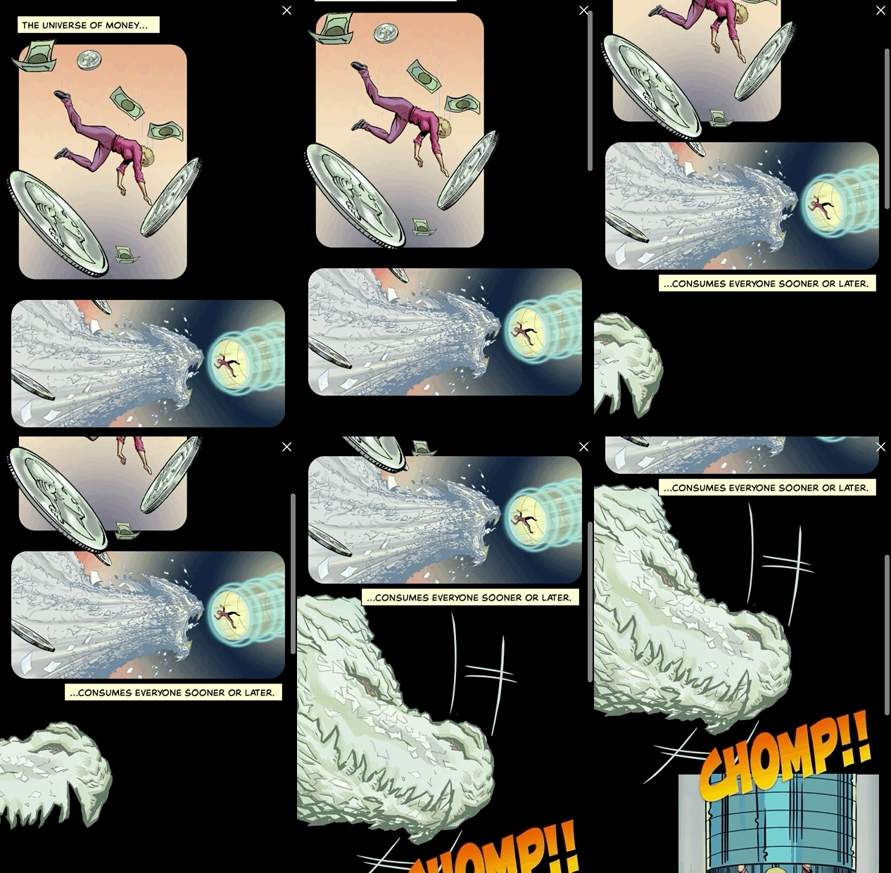
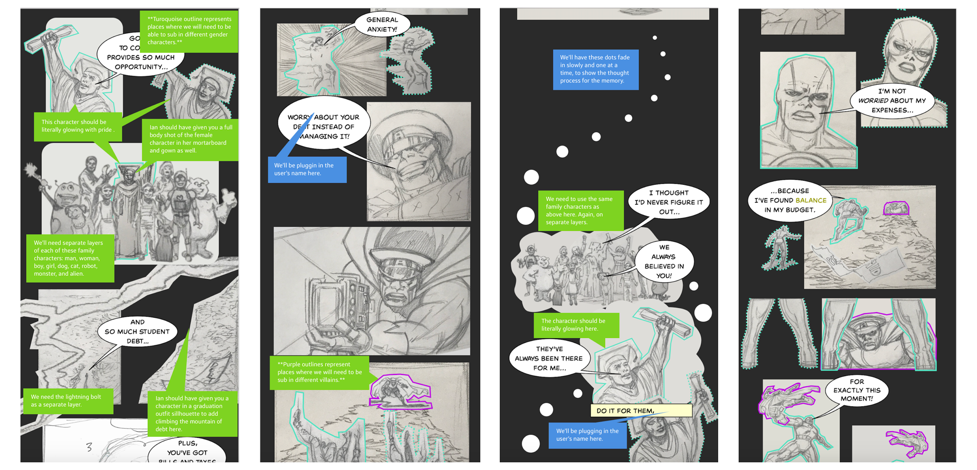
Once we had the story in a good place with the image panels, inline narrative text, and chat bubbles for all three current battle/villain options, it was time to think through the interactive animated elements. I knew right off the bat of a few places where I wanted to incorporate a parallax scroll effect, namely in the falling scenes where I thought it would help tell the story. Also, for the memory scenes, we purposely built in a trail of thought bubble dots, which we wanted to have fade in one by one to add time and suspense to the scroll. There were also a number of places where the user’s name needed to be subbed in (in the desk nameplate panel, as well as a few inline narrative text and chat bubble components. I included color-coded notes explaining all of these interactive components.
Defining Reusable Layers
Similarly, I created color-coded notes for the colorist showing panels where we would need separate layers for background, midground, and foreground parallax scroll elements as well as the characters (male vs. female, and different villains). By re-using backgrounds and creating separate layers for characters instead of creating full panels (colorists charge by the page), we were able to cut costs down on the art side significantly.
Comic Lettering
Static & Personalized Assets
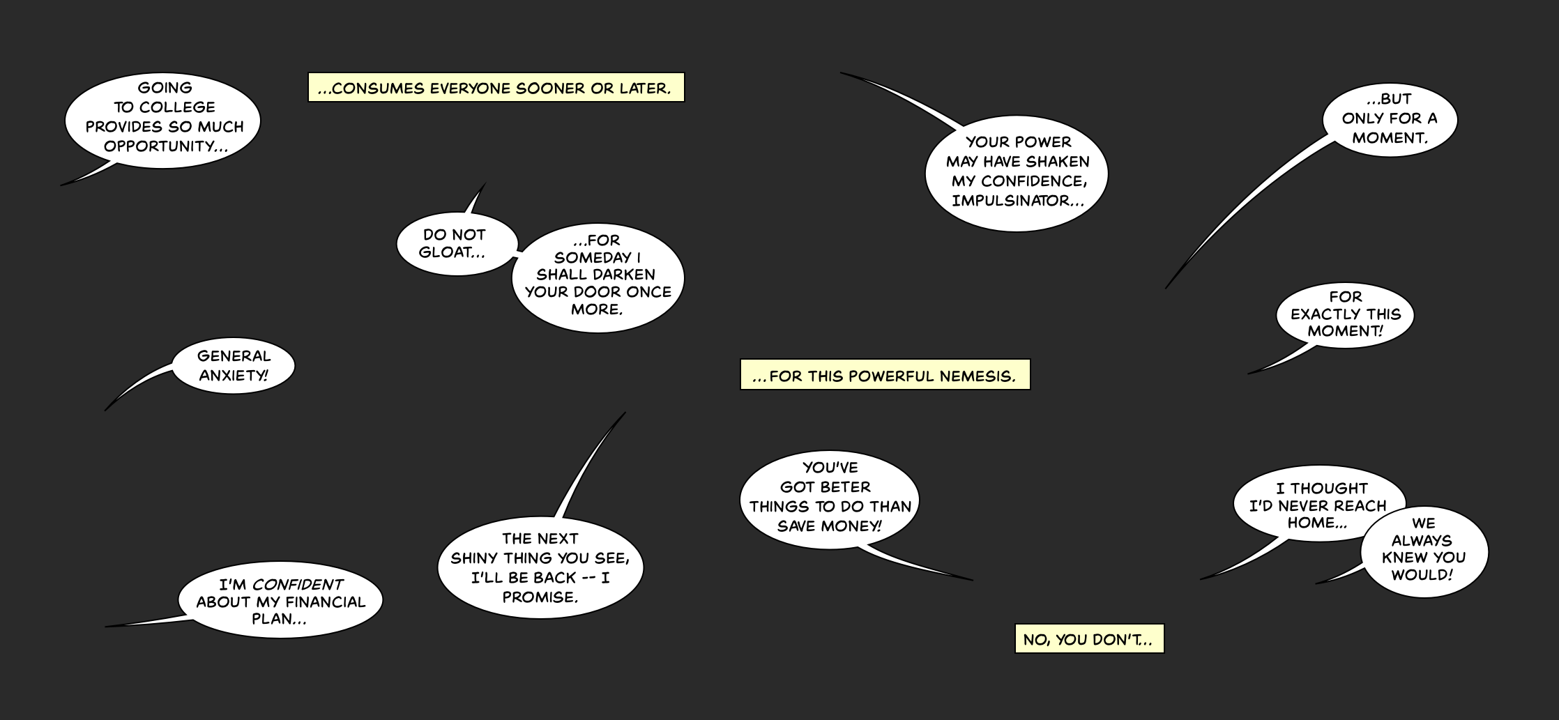
The colorist was hard at work coloring the inks and separating out character layers and background layers and the developer was hard at work incorporating the new chat bubble and inline text assets into the build, replacing the layout images with pencil images based on my reference wireframe, running tests for different skin and hair layers, and playing around with the different opacity and scroll effects based on my animation requests. Meanwhile, I started doing a more high fidelity text pass on the chat bubble and inline text assets. Much to Ian Dorian’s dismay, we didn’t have the resources to engage a professional letterer, so we ended up needing to purchase a font license. We ended up choosing Spinner Rack, a font that matched the Golden Age style (and had bold and italics options). After going through a few incredibly well-written tutorials on Chris Oatley’s website (about comic lettering layout and chat balloon rules) and downloading ComicLife, I was ready to go.
One plus that resulted in our decision to use a font over hand-lettered text was in the integration of the person’s name throughout the story. Because we already had access to every letter in the alphabet, we could easily translate a user’s name as character strings to the Spinner Rack font. Besides the x and y placement of the character strings, all we had to do was specify the alignment (left, right, or centered).
Graceful Degradation
Because there were so many places where we had to make server calls to sub in custom user name strings (for the name plate panel, a few chat bubble assets, and a few inline text assets), graceful degradation was also top of mind for this experience. We made sure to have an entire default version of the experience in the rare event of server issues. For example, instead of subbing in the user’s name on the name plate, we defaulted to a panel which had a nameplate with shadows on it rather than an empty name plate. In addition, instead of explicitly using the person’s name, we referred to them more generically as “you” or “our hero.”
ADA Compliancy
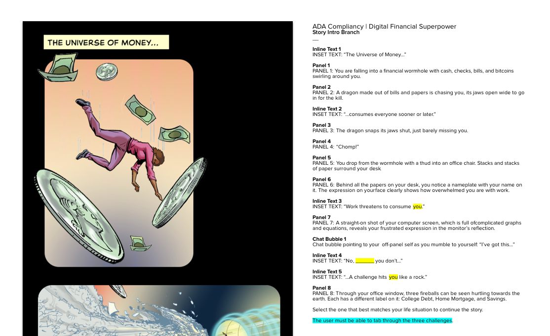
While I was waiting on the final colored images, I also met with our ADA team here at Capital One for tips as to how we could make this experience the same for everyone, regardless of their accessibility constraints. Like I mentioned above, inclusivity was one of our design principles and one of the reasons we wanted to do this experience in the first place, so meeting the strictest ADA compliancy guidelines was a must for us. I was already familiar with color contrast necessities before this project, so I knew the text color we were using for the chat bubbles and inline text components were legible and passed ADA requirements. I did, however, learn about needing tabbed controls for all interactive components as well as alternate text for every panel, chat bubble, and inline text asset, so I went straight to work building out a script which not only highlighted interactive components, but also explained each and every visual.
QA Testing
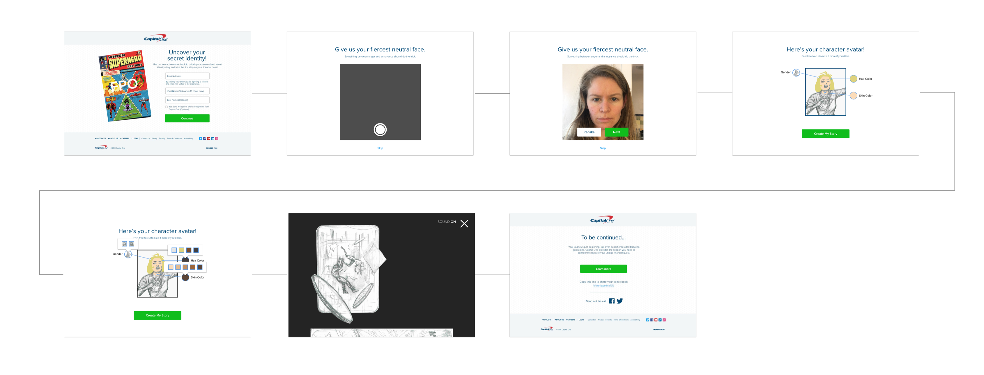
Once the experience was up and running with final colored images, dynamic branches, and animations, we started QA testing it on all platforms and browsers. Besides a few minor issues involving animation ordering, chat bubble alignment, panel layering, and things of the sort, we found a few major problems: 1. The avatar selection wasn’t truly responsive on mobile; and 2. the mobile Chrome browser wouldn’t allow us to access the camera for the selfie. After evaluating our options based on our tight deadline (the code freeze before the go-live date was now less than two weeks away), I made the executive decision to ditch the selfie altogether. It didn’t really add too much to the experience (some people didn’t even notice their reflection in the computer screen), it added an extra step to the introduction flow before our users arrived at the comic book experience, and with the browser issues, it was more trouble than it was worth.
Results
Finally, after 3 months of working nights and weekends, we had a beautiful, fully inclusive, interactive comic book experience that we were proud of. We thought everything was done… until I started asking questions about metrics… Our external partners, who were hosting the entire digital financial superpower microsite, were collecting basic metrics like number of users, device, and browser type, but because of the multiple hand-offs between partners, we discovered that no metrics were being collected on the interactive comic book experience itself! That meant that we wouldn’t know which gender, skin color, hair color, or current financial battle our users identified with. Considering that inclusivity was our driving principle, we absolutely needed these metrics to prove the experience’s worth. After lots of arguments back-and-forth about how no changes could be made during the code freeze, we finally convinced all of our external partners that we needed to add an API call that would save these metrics to our server.
Less than one week into the official launch of the experience, our unofficial metric numbers showed that over 6,500 people had gone through the digital comic book experience from beginning to end.

