Money App
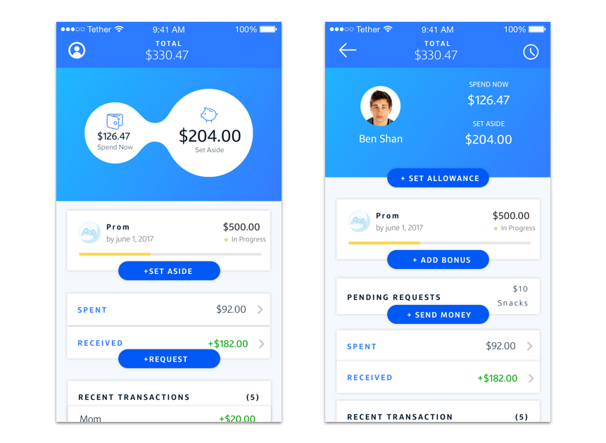
The Money app, which is now available within the existing Capital One mobile app (for both iOS and Android), seeks to empower kids to develop positive financial habits with the guidance and support of their families.
Kids between the ages of 13 and 17 with a Capital One Checking Account can spend and set aside money, set up goals, track their activity, receive in-app alerts, and receive allowances. Likewise, parents can track their kid’s activity, manage and send allowances, add comments (and emojis) with transactions as well as reward their kids for achieving specific goals.
My Role
As the lead designer from the very beginning, I worked on all aspects of this project, including research, wireframes, visual design, animations, production-ready developer hand-off, branding, and over-all creative direction.
Early Sketches & Wireframes
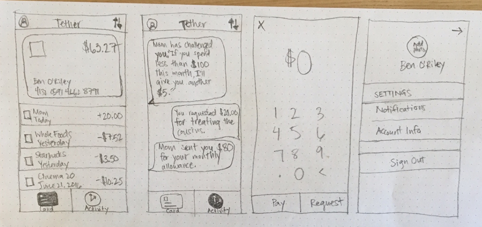
This was the first hand-drawn wireframe sketch we made for the app, which shows a simple, two-tabbed view from the teen’s perspective. Besides viewing debit card transactions and other money-related activity, the teen could access their profile information from the upper left hand corner as well as pay or request money from their parents by tapping on the action button in the upper right hand corner.
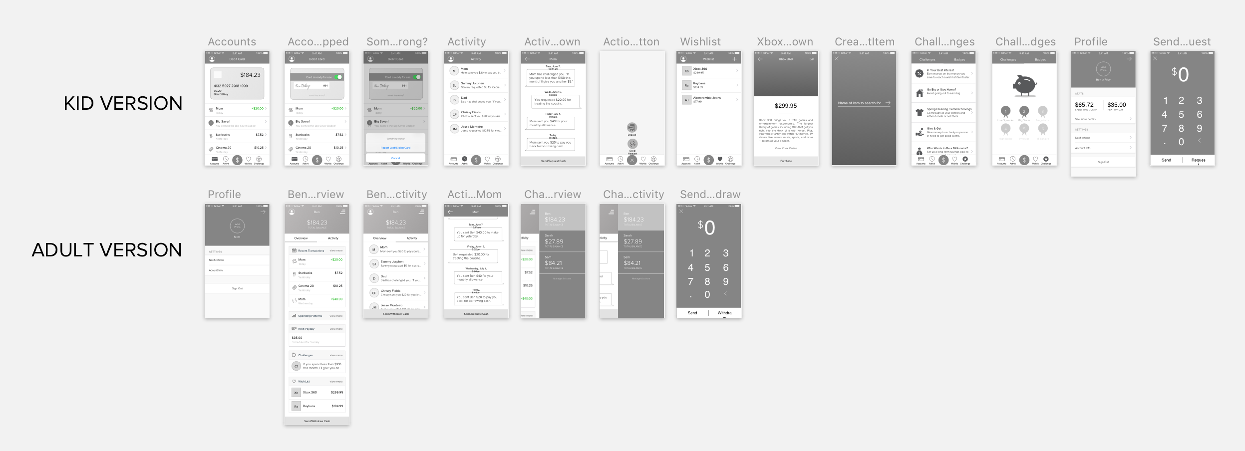
The unique challenge with this app was the fact that it had to be designed for two customers: parents and kids. Although the feature sets across the parent and kid sides of the app were similar (set/receive allowances, send/receive money, set/receive challenges, view transactions, etc.), parents and kids need different levels of financial zoom. From our research we learned that every parent has different financial values. Because of this, our app had to give parents full flexibility to manage their kids’ financial education without imposing strict guidelines. One of the most surprising findings from our research was that, because kids often have cash on hand, parents frequently use their kids as ATMs.
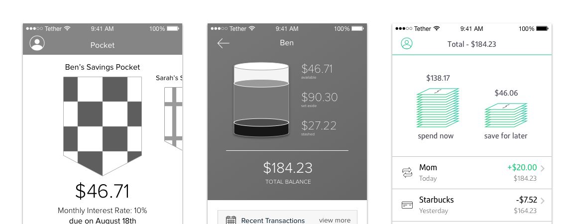
One of the hardest problems to solve was how to represent money that should be saved and money that could be spent in an intuitive yet fun way for kids. We experimented with a pocket and a stacked cylinder, among other things, before landing on the patented flexible bubble version, which is in the app today.
Interaction Design
Designing for both iPhone & Android
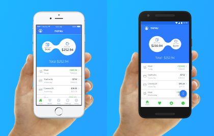
Something that was really important to me was that the Android version of the app followed Google Material design principles. I didn’t want the Android version to just have the iPhone designs “reworked” for Android. In addition to following the standard visual design practices, I encouraged the use of a floating action button instead of the middle tab bar action. I also worked with my two Android developers to have the dollar sign on the floating action turn into an “X” when tapped.
Visual Designs & Animations
This project was particularly fun because of its flexibility to push the traditional Capital One style guide a bit. Since the app was meant for kids, we were able to use more vibrant colors and fun animations.
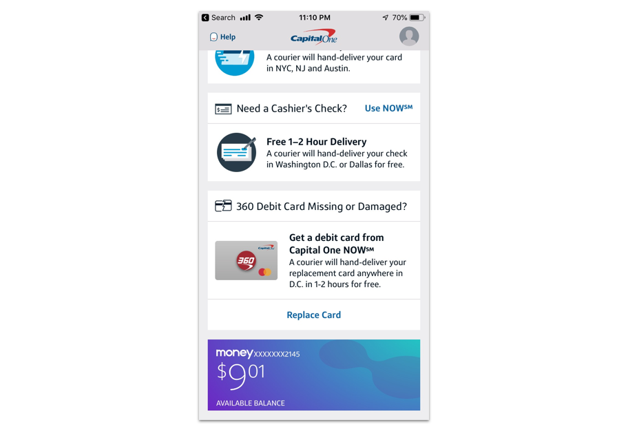
After a bit of exploration, we decided to use a purple and green color palette for the final implementation. Here’s the Money tile in-situ as seen from a parent’s Capital One app.
Results
Make it rain!
The feature usage percentages of the app are quite promising. For example, before the Money app, only 6% of parents used the recurring transfer feature to send money to kids. Now, through the allowance feature, 20% of parents are using it. We are also proud to say that 75% of kids use the unique “set aside” (aka save) money feature.
As far as the raw numbers go, we are getting 8,000 new users each month. By the end of July 2019, there were 250,000 people using the app.
The Money app also helped Capital One win “Best Banking Account for Families” according to Kiplinger.

