Kunstwinder
Kunstwinder is a boutique luxury watch winder company that aims to combine the beauty of precision mechanics with the whimsical charm of a collectable masterpiece.
Located in Silicon Valley, this family-owned company strives to deliver the ultimate line of watch winders to showcase your treasured timepieces.
Website Refresh
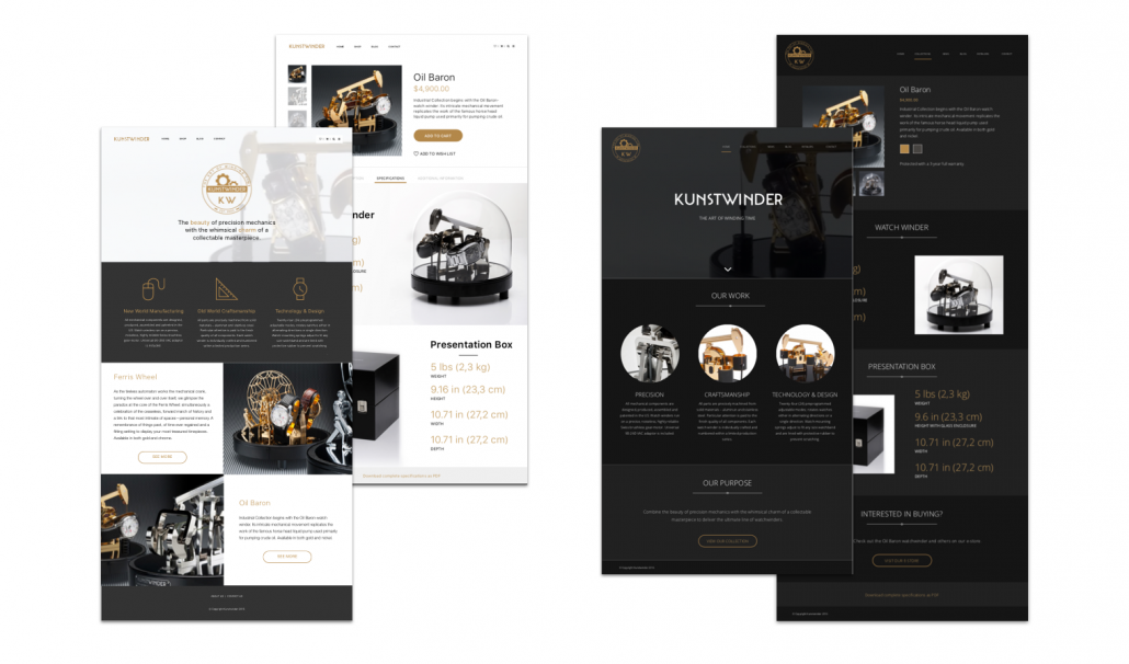
The website was in desperate need of a re-design. Not only did the original website look old, but it wasn’t responsive, and therefore couldn’t be viewed easily on devices other than computers. Featured above are two sample concepts I pitched for the Kunstwinder website re-design. We ended up going with a darker background color palette, like the one displayed here on the right. Check out the final website, which was brutally optimized for SEO, at www.kunstwinder.com.
Photography & Videography
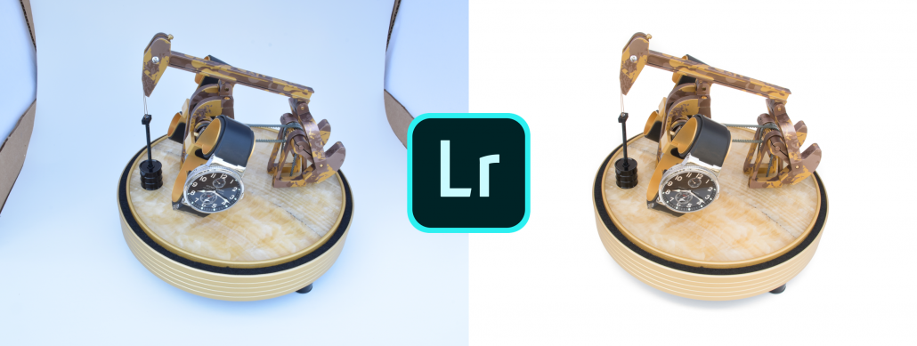
Besides shooting all the product photography in a home-made light box, I also took on the task of editing each of the photos. This included whitening the backgrounds, adjusting color balances, removing fingerprints and dust, touching up scratches, and removing brand logos on watches in some cases.
Much of the video work for Kunstwinder was both filmed and edited by me, including the hero video at the top of the website and this product video showing the Carbon Fiber model. Additionally, I wrote the script and recorded the audio for the Instruction Video featured at the top of this page.
Advertisement Materials
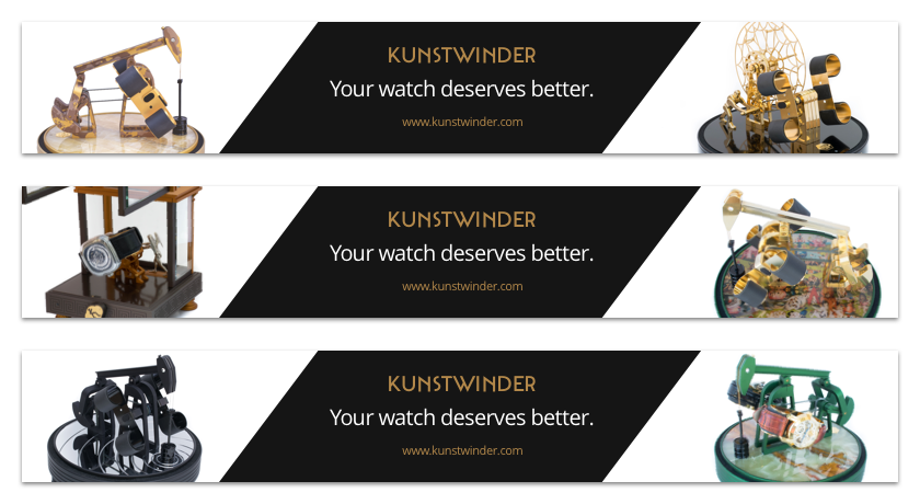
In order to drive more traffic to the website, I also created the designs for a number of website banner ads. Defining the content was really fun and I think I came up with a pretty clever slogan, if I do say so myself ;). One of the main websites we ran these banner ads on was www.watchwinder.com.
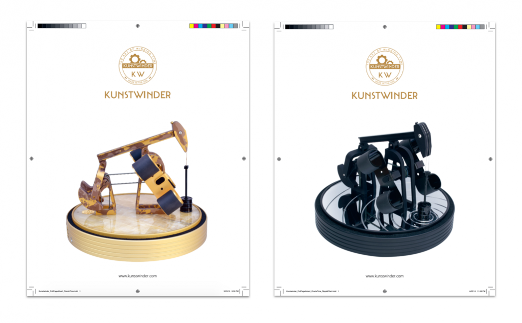
We also printed two full page advertisements in Oracle Time, a well-known watch and luxury lifestyle magazine. These designs were particularly fun for me because it was my first foray into both the advertisement world and the print world! Not only did it give me the opportunity to get my hands dirty with InDesign, a tool I hadn’t really used much before, but it also taught me a lot about dealing with transparency, resolution, pdf formats, ICC profiles, and color standards related to the print world.
Catalogue
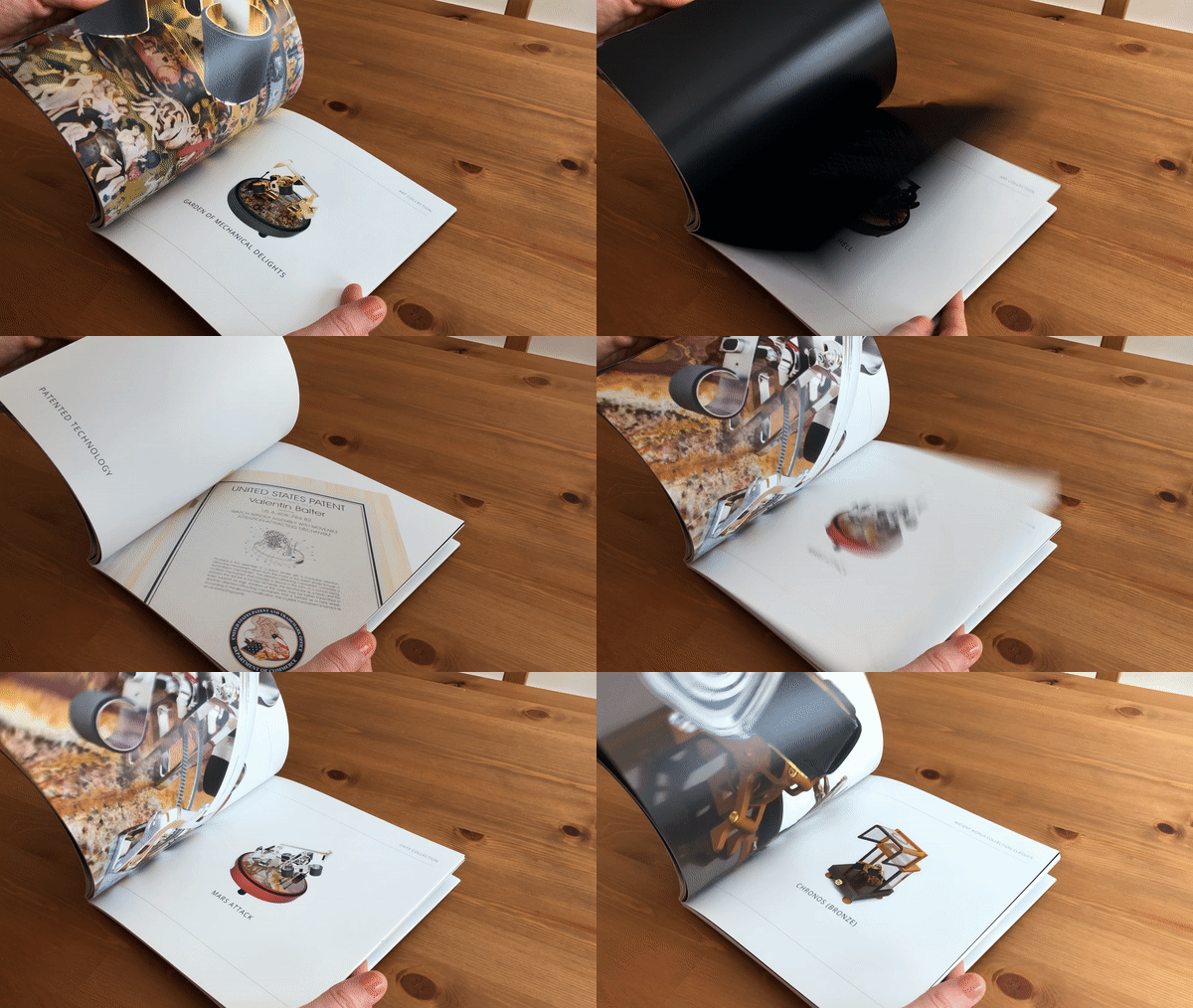
It was a good thing I had a chance to dip my toe in the shallow end of the print waters with the one-page magazine advertisements because I was about to dive into the deep end with a 52-page, 8″ by 8″ catalogue. Since I work so much faster using tools meant for the digital UI design world, I did the initial design exploration mock-ups and layouts in Sketch before moving into InDesign to finalize everything. I’m really proud of how it turned out!
Pitch Deck
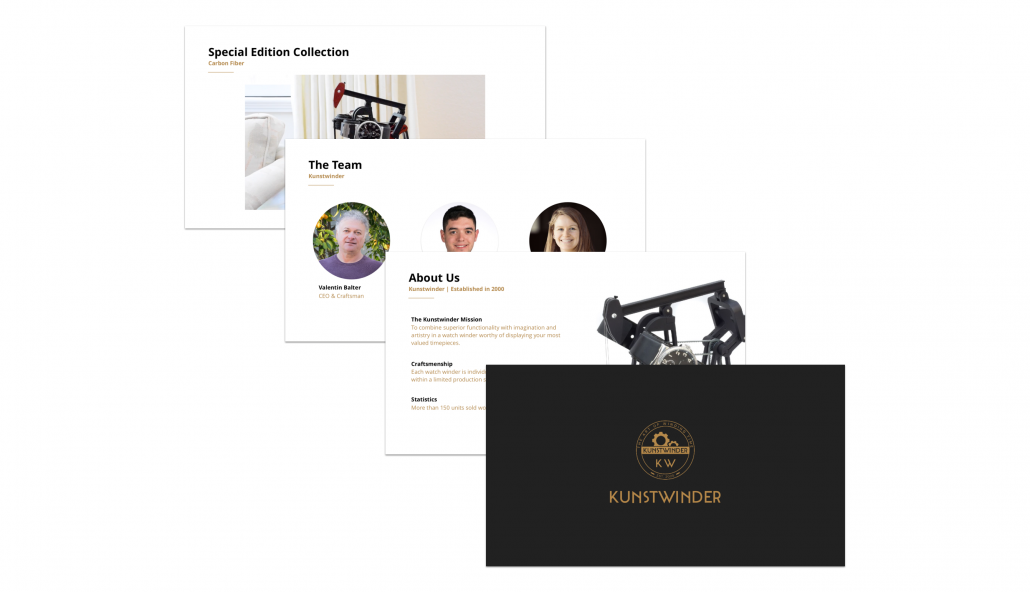
Besides the catalogue, I was also in charge of creating the Kunstwinder pitch deck and other template materials. These assets and materials helped us tell the Kunstwinder story and capitalize on potential partnership opportunities, especially those involving watch winder customization.
End-to-End Experience Strategy
Sexy Packaging, Easy-to-read Instructions, and Most Importantly, Excellent Customer Service
The new refresh helped with our potential customers’ perception of the brand, but I knew that the end-to-end customer experience was the most important (and still missing) piece of the puzzle — especially for a luxury brand like Kunstwinder. Great customer service, including insurance for reliable package deliveries, automatic client trust, and quick, efficient, and professional email communications, was a given. For example, one customer accidentally dropped the spherical glass case surrounding one of his watch winders. Even though the glass is rather expensive, we sent him a new one immediately, no questions asked. Besides the solid overall customer experience, we identified the receiving and opening of the package as a crucial touch point on the Kunstwinder journey map. Because of this, we decided to re-design the watch winder box using real wood and no screws, hinges, or other metal parts. Painted black with a single Kunstwinder logo engraved on the top, the new minimalist box embodied luxury.
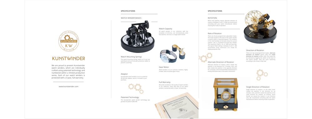
Also included in the watch winder box was both a certificate of authenticity and specification fold-out. The certificate of authenticity not only confirmed that the materials used to make the watch winder were only of the highest quality, but it also let them know that their watch winder was part of an exclusive, limited edition series. The specifications in particular, needed a lot of work. Initially imageless with large blocks of text written in minuscule, practically illegible font and engineering jargon on thin paper with a seemingly endless number of fold-outs, I re-wrote and re-designed the specifications. Besides using familiar language, I re-structured the content, breaking it out into scannable sections using titles, and added images to help evoke the information.
Of course, this specification update was also reflected in the online pdf version. Because ink was no longer involved in the digital version, I was able to use the traditional Kunstwinder black background as section headers.


